
An old saying states, “Do not judge a book by its cover”.
But we all know that is simply not true. We are drawn to books partly because of it’s cover. When we feel proud and cherish the books we own, then we want to show them off to the world. Or at least place them proudly on our bookcases.
This sounds like a good piece of advice. But many authors and publishers forget this simple idea.
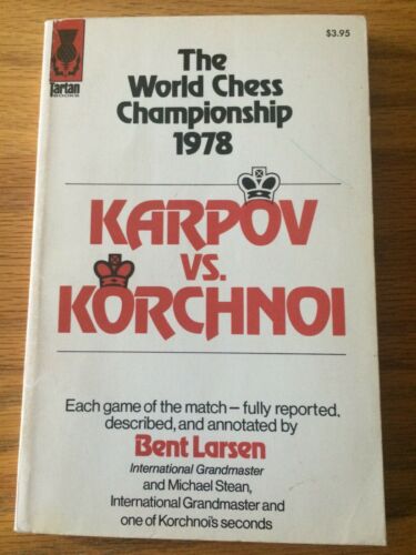
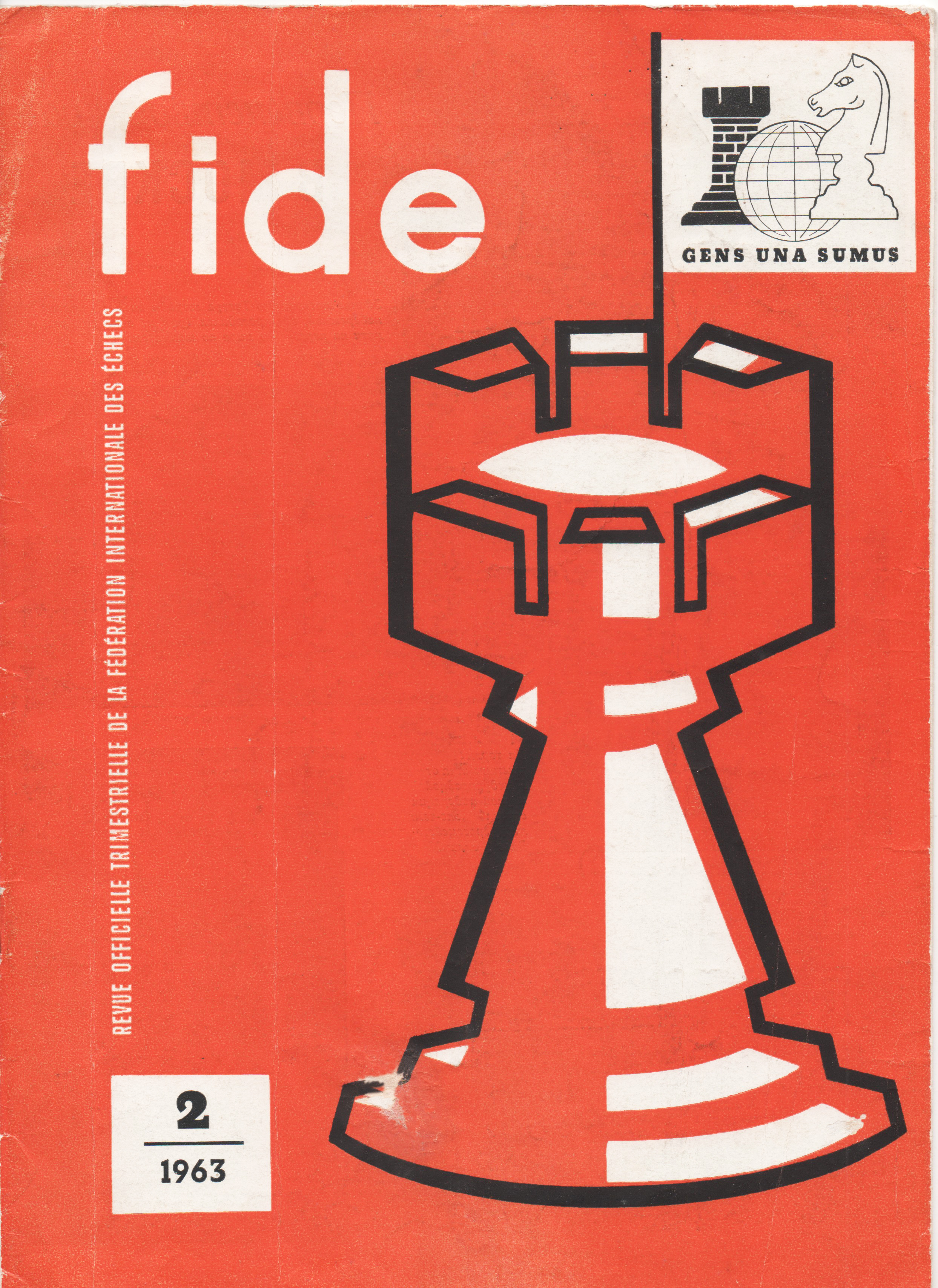
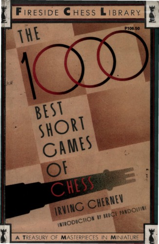
Some old chess books do not look attractive at all. They have bland, ambiguous, or simple covers and one gets the impression that no one really cared about their chess books.
Two words briefly and accurately describe these type of covers; Boring and Bland.
Here are some covers that illustrate this point.

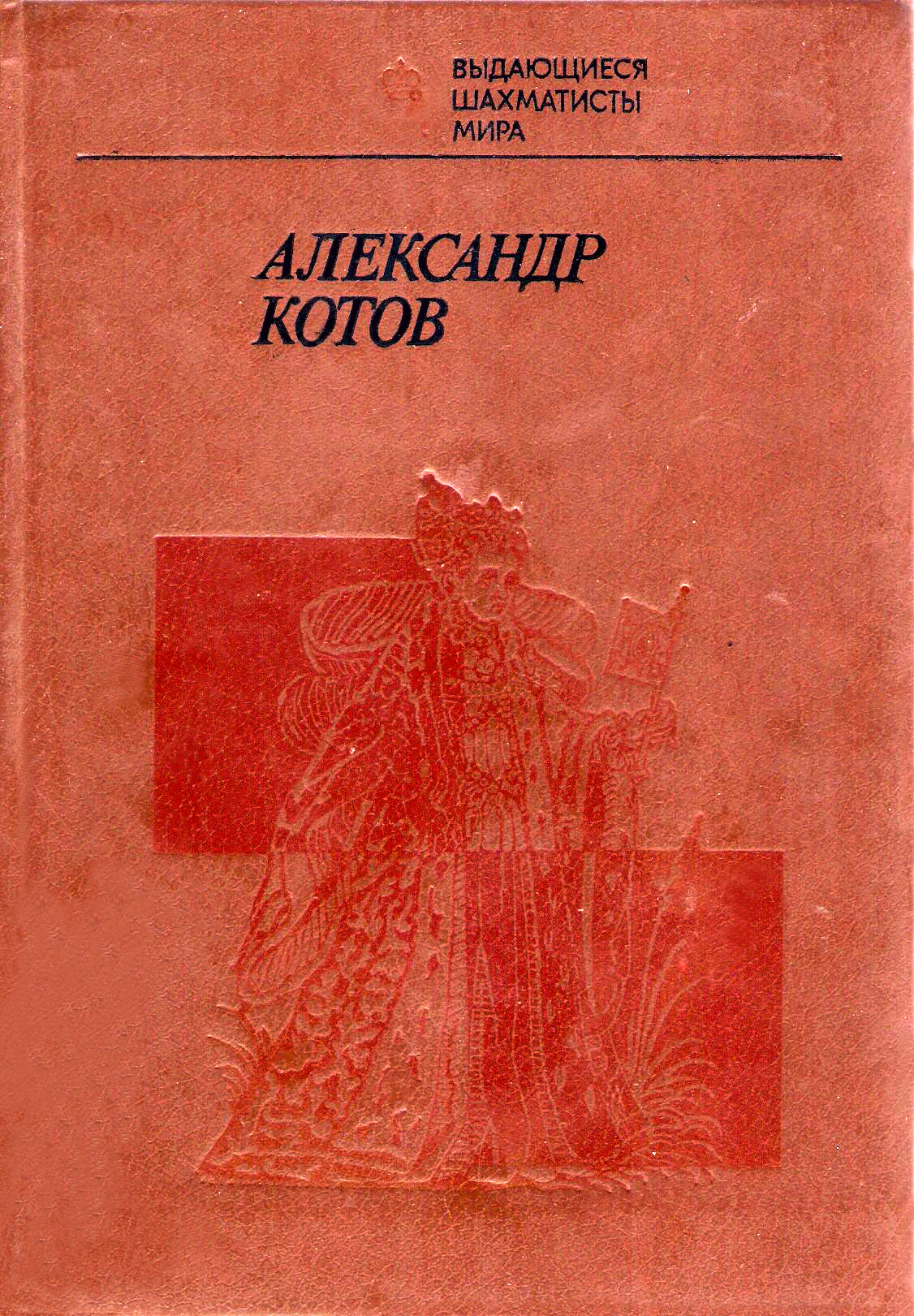
(This is an old book of Alexander Kotov’s games – in case you forgot your Russian.)
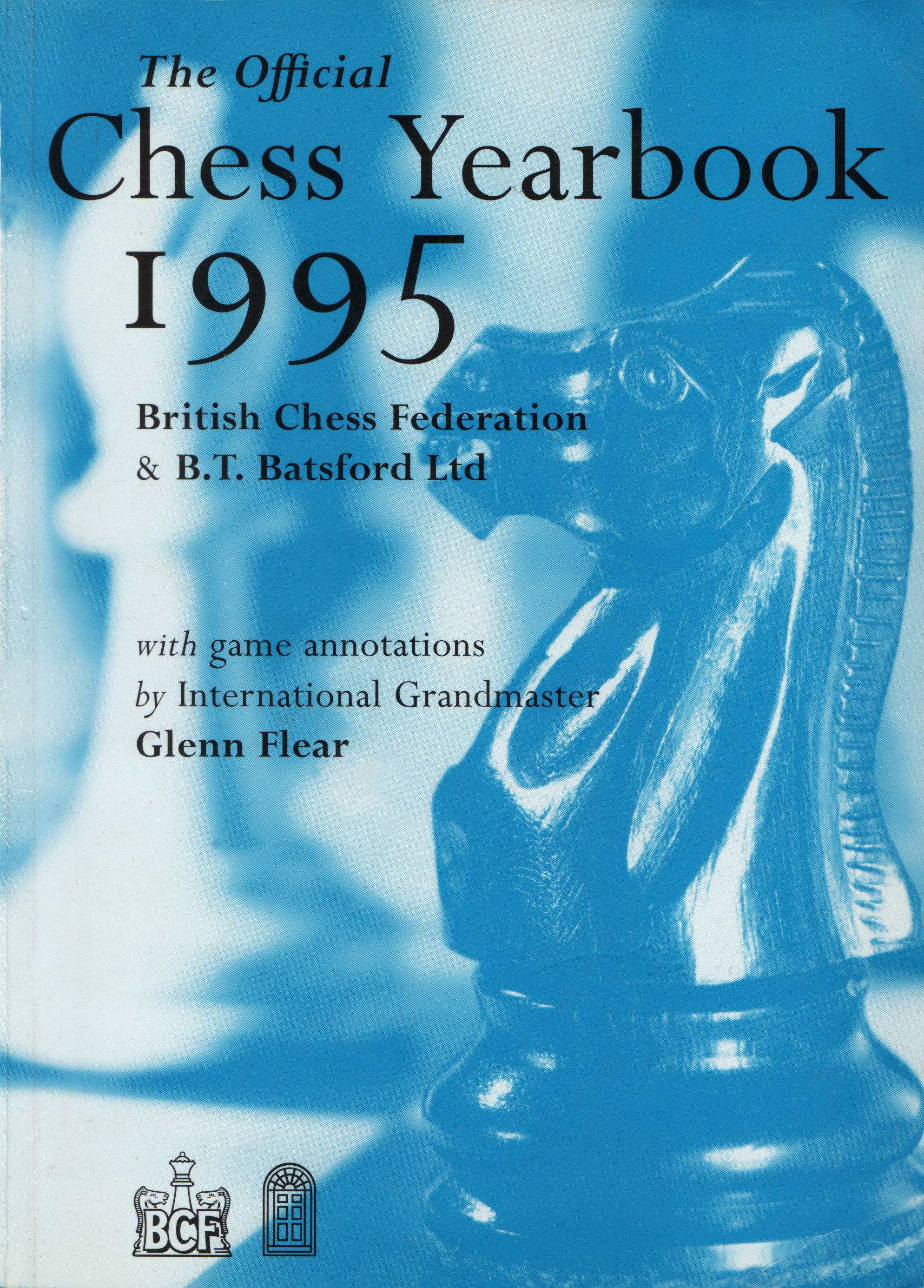
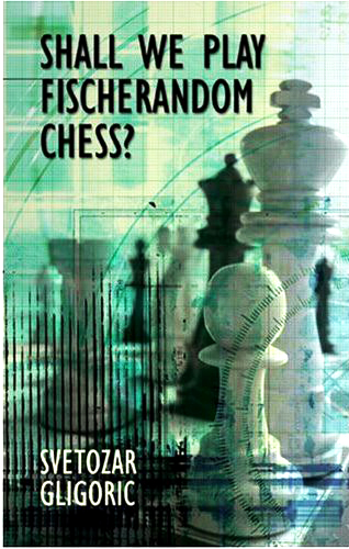
With the passage of time publishers realized that making a more attractive covers means more sales. So, they made covers that were attractive, at least for chess players.


But even then, publishers still missed a great quantity of potential buyers. What if they made covers, not just for the players, but for non-players as well?
Well, it turns out that many non-players actually do buy chess books with attractive covers.
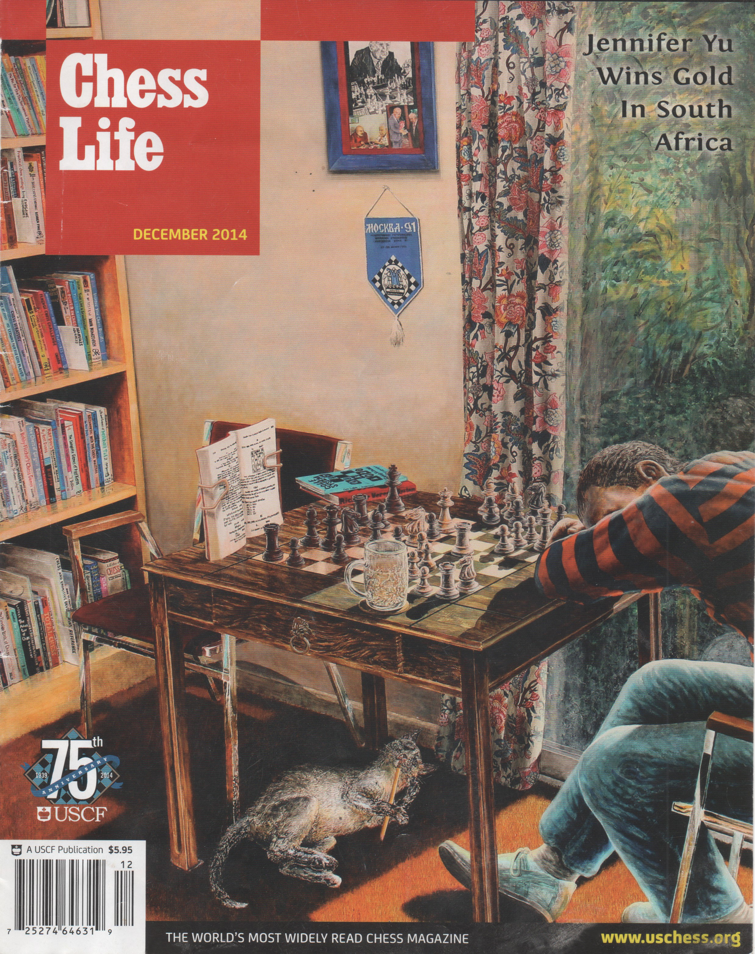
And it’s not just books, but magazines as well.

One medium I enjoy is colored pencils. Here is a recent Chess Life cover that was rendered in colored pencil.
So, if you have a good chess book to write or publish, take pride in your work – make your cover colorful, attractive, and appealing.
